Designing for Millions
Atlanta’s Smart Wayfinding System
Atlanta is evolving.
With millions of visitors arriving for the 2026 FIFA World Cup, the city needed a smarter, more intuitive way for people to navigate, access information, and connect with the urban environment.
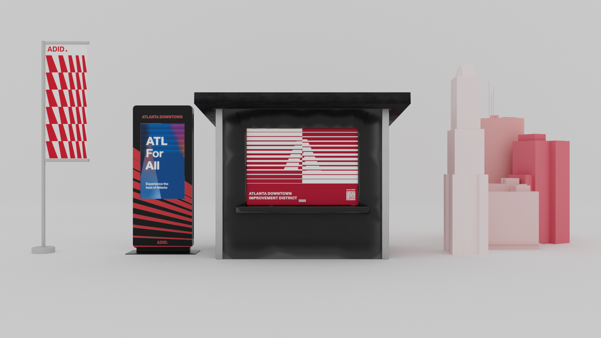
Atlanta Downtown Improvement District (ADID) needed a comprehensive wayfinding system—a blend of physical kiosks, digital navigation tools, branding, and city guidelines to create a seamless urban experience.
The Challenge:
Atlanta’s navigation system was outdated, lacking real-time updates, accessibility, and cohesive branding.
Tourists and residents alike struggled with confusing transit maps, limited wayfinding options, and scattered information sources.

The Solution:
A Comprehensive Smart City System
Recognition
Engagement
Expansion
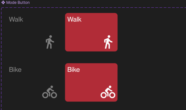
UX/UI DESIGN:
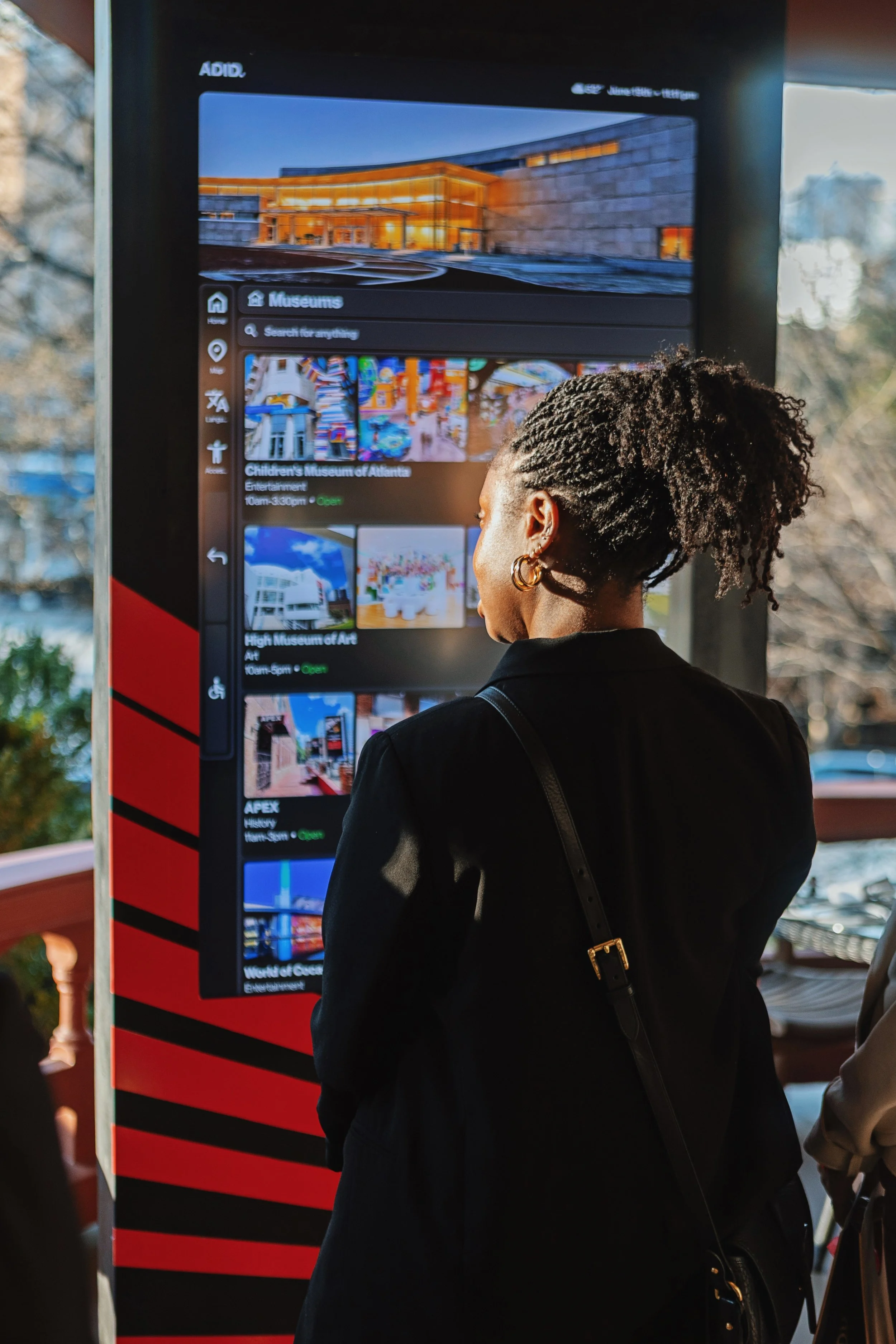

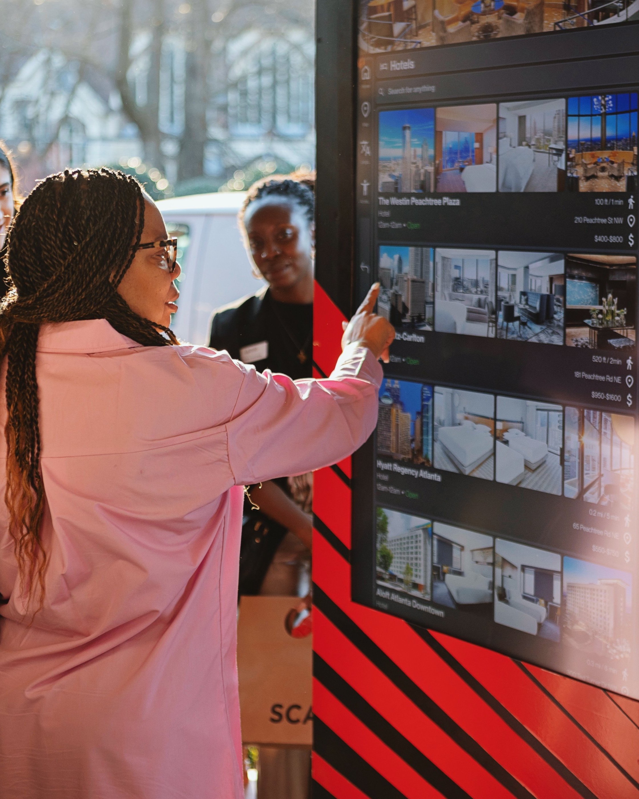
A woman interacts with a full-scale prototype, navigating local attractions and city information.
Design Objectives:
Our goal was to create an interface that feels effortless—even under stress. The kiosk UI had to be:
✅ Intuitive for first-time users (tourists, non-English speakers)
✅ Fast and responsive for crowded environments
✅ Accessible across visual, cognitive, and physical abilities
✅ Scalable for future updates and city-wide deployment
Design Outcomes:
📌 Long-Term Scalability & Future-Proofing
• OTA (over-the-air) updates ensure ongoing improvements without needing physical modifications.
• Designed as a modular system that can be expanded across multiple city districts post-World Cup.
📌 Enhanced City Experience & Engagement
• Wayfinding stress reduced through intuitive UI, clear directions, and real-time updates.
• Supports Atlanta’s smart city vision, with data-driven insights to improve urban navigation for years to come.
📌 Faster & More Efficient Navigation
• Average user session time: 27 seconds, ensuring quick and efficient access to essential information.
📌 Improved User Experience & Accessibility
• 92.3% task success rate in usability testing for essential wayfinding functions.
• Tailored for non-English speakers, ensuring intuitive navigation regardless of language barriers.
• ADA-compliant design increased accessibility confidence, with visually impaired users able to complete interactions using screen readers & high-contrast modes.


Validated through multiple rounds of testing with real users interacting with the full-scale prototype—achieving a 92.3% task success rate.
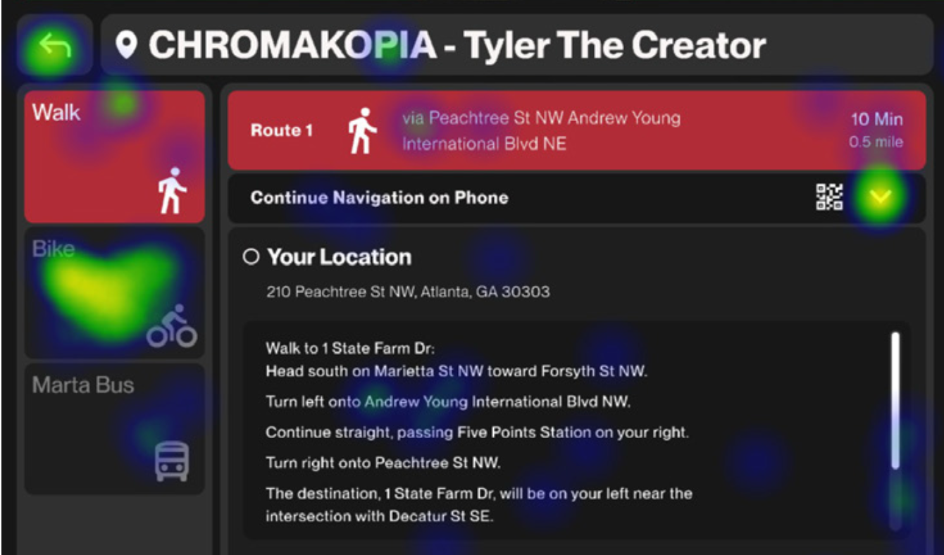
Heatmap analysis was used to evaluate whether users were interacting with the intended areas of the kiosk interface.
To ensure ADA compliance and enhance wheelchair accessibility, key interactive elements—such as the carousel and Atlanta exploration categories—have been repositioned to the lower portion of the screen. This adjustment improves usability for individuals with mobility limitations.
Designed to guide unfamiliar users with clarity and ease. Expected actions are reinforced with microinteractions—such as subtle button animations and progress indicators—to build confidence and reduce hesitation throughout the experience.
What methods are used to measure the impact of your service on the Atlanta community and its visitors?
How Are People Using the Kiosk?
Session Length
Pages Per Section
Heat Maps and Click Maps
How Do People Enjoy the Kiosk?
User Satisfaction Score
User Feedback Score
Net Promotor Score
How Many People Are Using the Kiosk?
Daily Active Users
Monthly Active Users
Street-Level Service Hub
Next up
What Impact Is the Kiosk Having on Mobility?
Transit Directions Viewed
Walking Routes Selected
Inquiries Deflected from Physical Ambassadors
What could improve the kiosk?
Add your pricing strategy. Be sure to include important details like value, length of service, and why it’s unique.
What Do With All This Information?
Understand Your Audience
Execute Data-Driven Decisions
Refer To Existing Initiatives
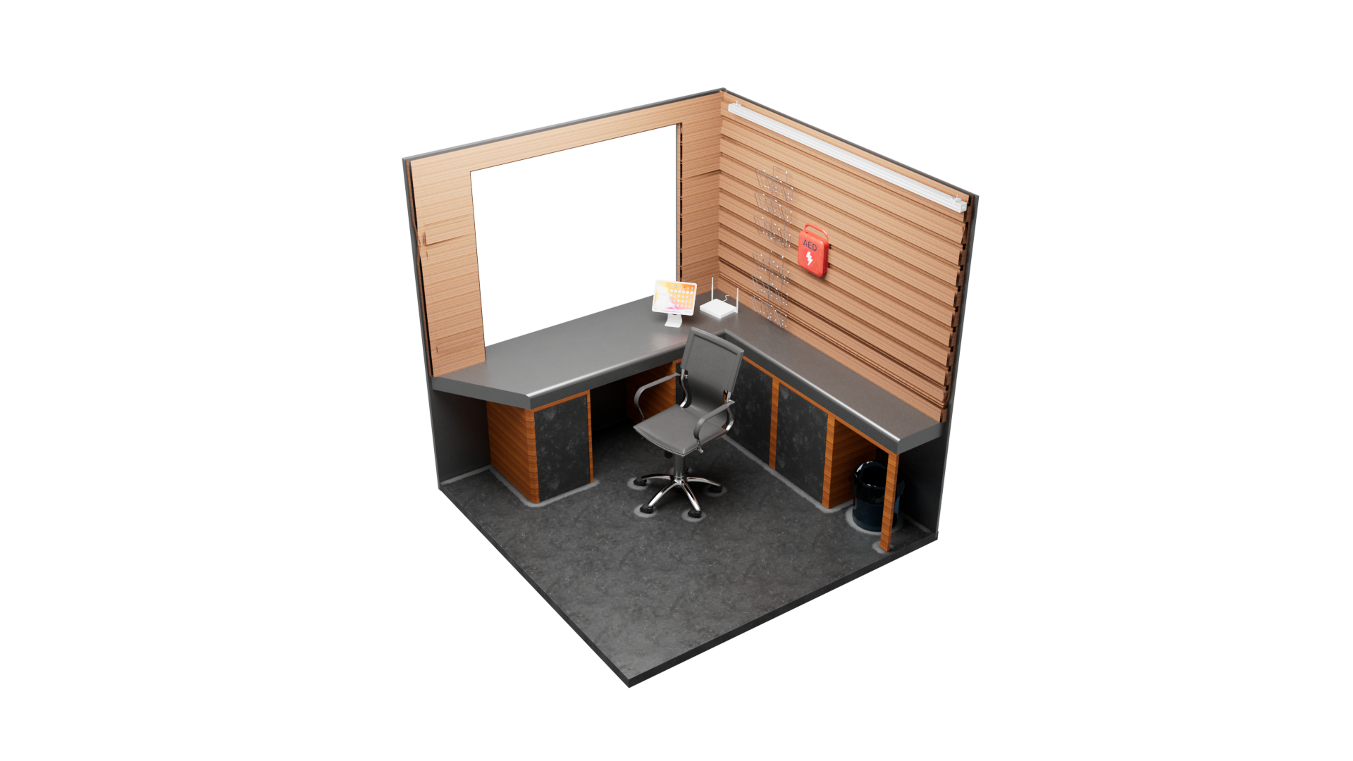
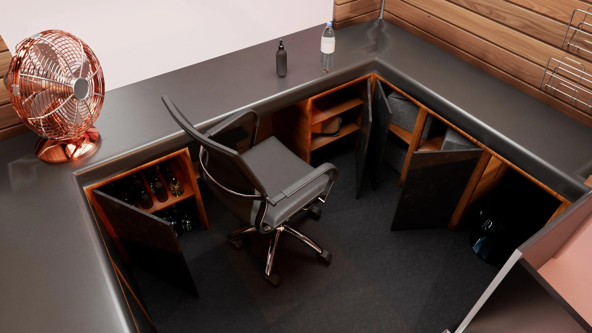
The new information booth isn’t just visually updated—it’s thoughtfully designed to support those who use it every day.
• Emphasized Comfort — A welcoming, ergonomic workspace for ambassadors supporting city guests.
• Improved Storage & Safety — Better organization and built-in safety features for smoother day-to-day operations.
• Integrated Technology — Equipped with a tablet system for real-time updates, digital support, and service efficiency.
Branding and Service Design

Branding That Extends Beyond the Screen
The visual system was designed as a ready-to-use branding toolkit—scalable across print, signage, uniforms, kiosks, and digital platforms. It’s not just UI—it’s a citywide identity that brings clarity, consistency, and energy to the streets of Atlanta.

Download the Client Book
with Complete Branding Documentation